Style bundles with CSS
Updated Nov 11, 20268 min read
On this page (11)
Use CSS variables and named parts for changes beyond Customize the design.
Add your CSS
- Open and save your offer.
- On Offer (Bundle for bundles), open Advanced below Design.
- Copy the full value under CSS class, including the leading
.. - Replace every
.hype-offer-YOUR_OFFER_IDin the example with that value. - Paste into Custom CSS and click Save.
.hype-offer-YOUR_OFFER_ID { --hype-cta-radius: 999px; --hype-tile-radius: 8px;}.hype-offer-YOUR_OFFER_ID::part(title) { text-transform: uppercase;}YOUR_OFFER_ID is a placeholder. Each offer has its own CSS class.
Custom CSS allows up to 20,000 characters, but no </style> tag. Changes preview as you type.
For all offers, set variables on body in Hype: Bundles app-embed Custom CSS.
Variables
The Volume column identifies affected styles. Defaults precede Design overrides; button and badge variables require those elements.
Colors
| Variable | Changes | Default | Volume |
|---|---|---|---|
--hype-card-bg | Card background | transparent | Both |
--hype-card-border | Card border color | transparent | Both |
--hype-text | Main text | #161616 | Both |
--hype-heading | Block title, totals and category names | Same as --hype-text | Both |
--hype-text-2 | Secondary text, such as row prices and notes | 90% of the text color | Tiles |
--hype-muted | Labels and hints | 80% of the text color | Both |
--hype-faint | Crossed-out prices and unavailable options | 66% of the text color | Both |
--hype-border | Row lines and image frames | 14% of the text color | Both |
--hype-tile-border | Option tile borders | Same as --hype-border | Both |
--hype-border-strong | Dropdowns, radios, checkboxes and quiet buttons | 24% of the text color | Both |
--hype-surface-2 | Neutral badges and quiet buttons | 5% of the text color | Tiles |
--hype-surface-3 | Disabled buttons | 9% of the text color | Both |
--hype-control-bg | Tiles, dropdowns, radios and checkboxes | Same as --hype-card-bg | Both |
--hype-error | Error line under the button | #b42318 | Both |
--hype-divider | Line between rows and above the total | 1px solid, in the border color | Tiles |
--hype-on-accent | Text and icons on Color | #ffffff | Neither |
--hype-tint | Selected tile background | A 7% tint of Color | Both |
--hype-tint-strong | Tinted pills | A 14% tint of Color | Neither |
--hype-accent-text | Color when used for text | Color, mixed with the text color | Tiles |
--hype-savings | Savings text | Same as --hype-accent-text | Neither |
--hype-badge-bg | Badge background | A 12% tint of Color | Tiles |
--hype-badge-color | Badge text | Same as --hype-accent-text | Tiles |
--hype-focus | Keyboard focus outline | Color | Both |
--hype-selection | Highlight on selected text | A 30% tint of Color | Both |
--hype-strip-bg | Background of the total line | transparent | Neither |
Buttons
| Variable | Changes | Default | Volume |
|---|---|---|---|
--hype-cta-bg | Button background | Color | Both |
--hype-cta-color | Button text | #ffffff | Both |
--hype-cta-height | Button height | 52px | Both |
--hype-cta-radius | Button corners | 12px | Both |
--hype-cta-font-size | Button text size | 1em | Both |
--hype-cta-weight | Button text weight | 600 | Both |
--hype-cta-transform | Button text case | none | Both |
--hype-cta-tracking | Button letter spacing | 0 | Both |
--hype-cta-shadow | Button shadow. Use none for flat buttons | A soft shadow in Color | Both |
--hype-cta-shadow-hover | Button shadow on hover | A deeper shadow in Color | Both |
--hype-cta-disabled-bg | Disabled button background | Same as --hype-surface-3 | Both |
--hype-cta-disabled-color | Disabled button text | Same as --hype-faint | Both |
--hype-secondary-bg | Quiet button background | Same as --hype-surface-2 | Neither |
--hype-secondary-color | Quiet button text | Same as --hype-text | Neither |
--hype-secondary-border | Quiet button border | Same as --hype-border-strong | Neither |
--hype-pill-radius | Corners of the Mix & match buttons | 999px | Neither |
Shape, spacing and images
| Variable | Changes | Default | Volume |
|---|---|---|---|
--hype-card-radius | Card corners | 18px | Both |
--hype-card-padding | Space inside the card | 0px | Both |
--hype-card-shadow | Card shadow | none | Both |
--hype-tile-radius | Option tile corners | 14px | Both |
--hype-control-radius | Dropdowns, checkboxes and quiet buttons | 8px | Neither |
--hype-badge-radius | Badge corners | 999px | Tiles |
--hype-row-gap | Space above and below each row | 12px | Neither |
--hype-block-spacing | Space above and below the block | 16px | Both |
--hype-block-max-width | Widest the block grows | 100% | Both |
--hype-thumb-radius | Product image corners | 10px | Neither |
--hype-thumb-fit | How images fit their frame. Use cover to fill it | contain | Neither |
--hype-thumb-padding | Space between an image and its frame | 3px | Neither |
--hype-thumb-bg | Image frame background | Same as --hype-control-bg | Neither |
--hype-thumb-border | Image frame border | Same as --hype-border | Neither |
--hype-row-thumb-size | Row images in Lineup / Routine, Bought together and Add-ons | 48px | Neither |
--hype-lineup-thumb-size | Images side by side in Showcase | 72px | Neither |
Text
| Variable | Changes | Default | Volume |
|---|---|---|---|
--hype-font | Font | inherit | Both |
--hype-font-heading | Block title font | inherit | Both |
--hype-title-size | Block title size | 1.35em | Both |
--hype-title-weight | Block title weight | 600 | Both |
--hype-title-transform | Block title case | none | Both |
--hype-title-tracking | Block title letter spacing | -0.015em | Both |
--hype-eyebrow-size | Small line above the title: size | Same as --hype-label-size | Both |
--hype-eyebrow-weight | Small line above the title: weight | 600 | Both |
--hype-eyebrow-transform | Small line above the title: case | uppercase | Both |
--hype-eyebrow-tracking | Small line above the title: letter spacing | 0.08em | Both |
--hype-eyebrow-color | Small line above the title: color | Same as --hype-muted | Both |
--hype-body-size | Base text size | 1em | Both |
--hype-small-size | Notes and fine print | Same as --hype-body-size | Both |
--hype-strong-size | Current prices | 1.125em | Both |
--hype-total-size | The total, and the quantity in Tiles | 1.35em | Tiles |
--hype-price-weight | Current price weight | 600 | Both |
--hype-label-size | Small labels, badges and default eyebrow size | 0.75em | Both |
--hype-label-tracking | Small label letter spacing | 0.06em | Tiles |
--hype-numerals | Number style in prices | "tnum" 1, "lnum" 1 | Both |
Options popup
| Variable | Changes | Default | Volume |
|---|---|---|---|
--hype-modal-width | Popup width | 560px | Neither |
--hype-modal-bg | Popup background | --hype-card-bg, or #ffffff if unset | Neither |
--hype-modal-radius | Popup corners | Same as --hype-card-radius | Neither |
--hype-modal-padding | Space inside the popup | 22px | Neither |
--hype-modal-shadow | Popup shadow | 0 24px 60px -12px rgba(0, 0, 0, 0.45) | Neither |
--hype-backdrop | Color behind the popup | rgba(24, 23, 22, 0.55) | Neither |
Parts
Use ::part() after the offer's class, .hype-block for all blocks, or hype-bundle-options-modal for popups.
| Part | What it is |
|---|---|
card, head, title | The outer card, the header and the block title |
eyebrow | The small line above the title, and section labels |
cta, cta-wrap, footnote | The add to cart button, the area around it and the fine print under it |
badge | Badges, including Sold out |
thumb | Product images |
strip, strip-label | The total line and its label |
amounts, was, now | A pair of prices, the crossed-out price and the current price |
savings | The savings text |
option, option-selected | A selectable row or tile, and the selected one |
option-title, option-note | The title and note inside a selectable tile |
radio, checkbox | The selection controls |
rows, row | A list of products and one row in it |
row-title, row-price, row-note | A row's product name, price and note |
product-link | A product name that links to its page |
variant-select, variant-chip | The variant dropdown and the read-only variant label |
choice, choice-option, option-body | The Just this item or bundle chooser, each option in it and the option's contents |
min-extras-hint | Frequently bought together: the button text while too few extras are ticked |
rating, lineup | Showcase: the rating and the row of images |
grid, save-badge | Tiles: the row of tiers and a tier's savings badge |
progress, progress-label, slots, slot, slot-filled | Mix & match: the progress area, its text, the row of slots, one slot and a filled slot |
categories, category, category-open | Mix & match: the list of categories, one category and an open one |
category-head, category-title, marker | Mix & match: a category's header, its name and its number or check mark |
pick-button | Mix & match: the button that picks a product |
quantity-control, quantity-minus, quantity, quantity-plus | Mix & match, with Allow multiple units of the same product: the quantity control and its parts |
option-pill, secondary | Options popup: a variant choice and the back button |
Volume block parts
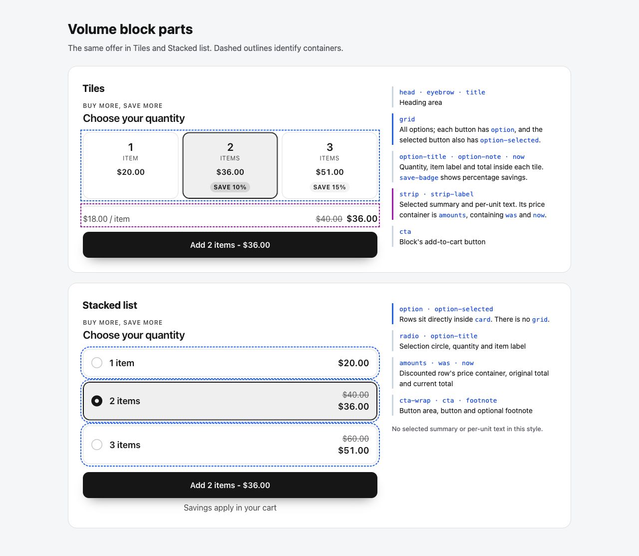
All volume parts, including those not displayed:
| Part | Tiles | Stacked |
|---|---|---|
card | Outer card | Outer card |
head | Header | Header |
eyebrow | Small line above the title, when nonempty | Same |
title | Block title | Block title |
grid | Options container; wraps at 80 px minimum per option, 8 px gap | Absent; options sit in card |
option | Every option button | Every option button |
option-selected | Selected option button, also has option | Same |
option-title | Quantity number | Quantity and item label |
option-note | Item label | Not displayed by current offer settings |
now | Each option's total AND the selected summary total | Each option's total |
save-badge | Savings text on positive percentage-discount options | Absent |
strip | Selected summary | Absent |
strip-label | Per-unit text in summary, for quantities greater than 1 | Absent |
amounts | Summary price container | Price container on discounted options |
was | Summary's regular selling total, when discounted | Each discounted option's regular selling total |
radio | Absent | Selection circle |
cta | Block button, when enabled | Same |
cta-wrap | Absent | Button, error and footnote container |
footnote | Absent | Footnote, when filled |
badge | Not displayed by current offer settings | Same |
| No named part | Error text; use --hype-error | Same |
| No rendered element | Per-option original/unit prices, savings amounts | Per-option unit prices, savings amounts |
Replace every .hype-offer-YOUR_OFFER_ID below with your Advanced > CSS class value. This changes corners, selected borders and Tiles spacing:
.hype-offer-YOUR_OFFER_ID::part(option) { border-radius: 8px;}.hype-offer-YOUR_OFFER_ID::part(option-selected) { border-color: #087f5b; box-shadow: inset 0 0 0 1px #087f5b;}.hype-offer-YOUR_OFFER_ID::part(grid) { gap: 12px; grid-template-columns: repeat(auto-fit, minmax(110px, 1fr));}@media (max-width: 420px) { .hype-offer-YOUR_OFFER_ID::part(grid) { grid-template-columns: 1fr; }}::part(now) also affects the Tiles summary; there are no separate price parts. ::part(option) .now cannot select a child. CSS cannot create missing dynamic prices.
Products in Fixed bundle, Frequently bought together and Mix & match expose data-product-handle inside the block. After loading, app-embed Custom JS can read it through shadowRoot; CSS cannot select it.
Good to know
- A value set in Design, or by a Theme, wins over the same variable in Custom CSS. Clear the setting, or add
!importantto your CSS. - CSS selectors can't reach inside a block. Use the variables and
::part(). - Change the accent with Color, not
--hype-ac: its tints won't follow. - The options popup sits outside the block, so set its variables on
body. - Use Placement to choose add-to-cart buttons. Hiding
ctawith CSS does not connect your theme's button.
Related
Was this article helpful?
Related articles
Still stuck?
Ask a follow-up and we'll see it came from “Style bundles with CSS”.
Opens chat with your question and a link to this article.